Showing posts with label Lil Inker Designs Stitched Rectangle Mats. Show all posts

Saturday, 15 July 2017

Rainbow Letters

Hey stampers, Anni here!

I told you a few stories about my nephews in recent weeks. Today I have another card for one of my nephews - the youngest one.
He had his confirmation a few weeks ago. And I needed a card. For a boy. A teenage boy. For a confirmation. Couldn't get much harder, could it?


After a lot of thinking I decided to go simple! And a rainbow couldn't hurt!
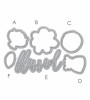
I started by die cutting all the letters of the german word for confirmation with the Inline Alpha Die set by AlteNew from watercolor cardstock.
I pressed some ink pads in rainbow order on my craft mat, added water and dyed the letters with the mixture. If it wasn't intensiv enough, I repeated the process.


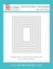
I die cutted a recangle with Lil'Inker Designs' Stitched Mats: Rounded Rectangles and adhered the letters in groups of three. After that I glued the panel onto a white cardbase.


Thanks for stopping by and have a great weekend.


Tuesday, 4 October 2016

Using Negative Diecuts to Great Effect

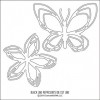
Colorful greetings, crafters! Today I am using some fantastic stamps and dies by Concord & 9th. Actually, I am mostly focussing on the negative die cuts from the butterfly die that is so wonderfully intricate it's a pure joy to use:


Since I wanted the colors on this butterfly to shine, I selected to go with some black card stock as a base here. I started out by adding some Stick It to a piece of paper and die cutting it with the butterfly die. The adhesive side would be on the bottom to attach the pieces to the card. I used the outline of the butterfly on another project and the negative pieces here: I used my Copic markers to create a gradient following the color wheel and kept my colors light so they would shine against the black.


To add my pieces to the card, I die cut the butterfly again from some sturdy card stock and used the outline as a placement help – I just laid it where I wanted the pieces to go and then puzzled them in. Since my butterfly didn't have a body, I grabbed a few pearls in different sizes and glued them where the body would go. Of course I needed a nice and bold sentiment, and I heat embossing the words from the Classy stamp set in white embossing powder.


The black mat was cut using my all-time favorite Sunshine Layers dies by Wplus9, and the card base itself was covered with a piece of grey paper which I had run through my Stitched Mats dies to create the stitched border.

Thank you for stopping by today! I hope you got inspired!

Saturday, 1 October 2016

Intricate Die Cuts and A Soothing Color Scheme

Hello crafty friends! It's the weekend again, and I hope will have time to craft a bit and just let your soul relax. To inspire you, I'm sharing a project featuring Concord & 9th supplies today. Mainly, I have fallen for the gorgeous, intricate flower die cuts:


I die cut those flowers from very sturdy card stock (scraps I found lying around) and then colored them with one color of Copic each. I made sure to have a light one, one mid-tone, and one dark blue-green color. Then it was just about arranging those flower on my center piece and not cover up too much of the sentiment:


The sentiment is from the Being Classy stamp set – I love the big handwritten font, it can be the centerpiece of a card just by itself. As for the color scheme, I actually looked that one up on Pinterest and I love the soft browns with the fresh mint colors.


For embellishment, I added a few pearls and dots with a silver gel pen. You know I can't help myself ;)

Thank you for stopping by today! I hope you got inspired!

Saturday, 7 May 2016

What If Space Was Pink?

Greetings, crafters on planet earth! As the big sci-fi fan that I am I fell in love with My Favorite Things' Out Of This World the moment I saw it. And, assuming that not all aliens are of the evil X-Files kind but maybe more along the lines of ET, I decided that my own space explorer would be from a planet where the dominant color is pink (wouldn't we all want to live there??).


I am still struggling with soft sponged backgrounds – I keep re-watching Laura Bassen's videos, but when I start to use ink I just have to add more. And more. And more... Anyhow, I am happy with the colors, even though I had wishes they'd come out softer, but ... pink!


The spacecraft was colored very simply. I know we can start to discuss light sources, and which parts of the craft protrude and would cast shadows, but I know that some of you get so confused by this that you rather not color something at all for fear of doing it wrong. Here's a secret: it's YOUR space craft. Color it any way you want. Meaning: it's ok to keep your coloring to the basics. Craft in a way that makes YOU happy. It's your hobby, you ain't doing for anyone else.


I mounted the space craft with some foam tape to my panel and then added a few stars in colors that would go well with the pink sky. And there is my pink space craft. Makes me kind of wish that ESA or NASA would paint their space craft pink. For realz!

Thank you for stopping by today, I hope you had fun! If you'd like to see how I created the card, head on over to my blog (link in profile) for the video tutorial. Cheers!
Saturday, 20 February 2016

Create A Card With (Almost) Die Cuts Only

Hi crafty friends! Today I have a card that is, except for the sentiment, all die-cutting. I am using a set by Paper Smooches which can be combined with the Calico stamp set, but they are not an exact match.


I went the easiest route – I simply die cut my pieces from colored card stock. If you don't have colored card stock, you can cut white paper and then color it either by pressing your ink pad down on it or using markers to color the die cuts.


Of course, you know me, I couldn't help but embellish the die cuts a bit after I adhered them to my card base. I used a white gel pen, a black glaze pen, and a Stardust gel pen and added a few dots here and there, just to add the little extra touch to the card.


The sentiment is also by Paper Smooches; the Uplifters is a great set that can be used for many different occasions.

Thank you for stopping by today, I hope you got inspired!

Saturday, 13 February 2016

Create A Realistic Brick Wall (On Your Cards)

Hey there, crafters! I have been dying to create a card like the one I am sharing with you today. Not only did I want to give my embossing paste something to do again, I wanted to tint it a bit for an even greater effect.


I started out by applying the paste through my MFT stencil, and then I set the card base aside to dry. It takes about half an hour to an hour before the paste is dry enough to distress without smearing it, so I set out to create my florals in the meantime.


I stamped the  Doodle Buds by Wplus9 on watercolor paper and colored them with a variety of markers: ZIG Art & Graphic, Distress Markers, and Stabilo Markers. Since they are all water based, they work together nicely. After I had dried the flowers with my heat gun, I used the matching dies to cut them out. I added a few highlights with a white gel pen and my Stardust pen after adhering them to the frame.


Before I adhered the flowers and the frame, I placed my stencil back on the now dried surface and grabbed a few Distress Inks. Very carefully, I sponged on some color to create the look of bricks, but without getting ink on the actual card base. It looks fantastic from the side because you can still see that the bricks are white underneath the thin layer of color.


Of course I only thought about the sentiment when it was almost too late and I decided to take a risk and stamp on top of the embossing paste. Could have ruined the entire project, but you know me – if it doesn't get my adrenaline level to rise, it ain't worth it ;)

Hope you enjoyed today's project and got inspired to color dried embossing paste. It's fun!