Showing posts with label My Favorite Things Mini Stitched Scallop Circles. Show all posts

Saturday, 18 March 2017

Sorry I'm Slow!

Hey stampers, Anni here!
If you believe it or not I didn't see Jill's card from last week's post before I made this card... Great minds think alike, don't they?


I started by creating a watercolour background. I didn't use any fancy watercolours, just some dye inks (which are fancy, too, of course). I pressed them on a piece of acetate, sprayed them with some water and smooched it onto a piece of watercolour cardstock. After it dried I stamped the sentiment with black ink onto it.


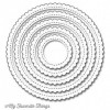
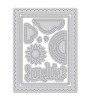
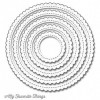
I stamped and coloured the sloth from Lawn Fawn's Set called Hang in There with coloured pencils. For the highlights I used a white gel pen. After fussy cutting (if you don't like fussy cutting you can use the matching dies, of course) I die cut a frame for the sloth. To create that frame I combined My Favorite Things Stitched Mini Scallop Circle STAX with a regular circle die.

I went for a aqua cardbase - usually I use only white cardbases - and assembled the card.

Thanks so much for stopping by and have a great weekend!
Anni


Saturday, 15 October 2016

A Square Peony

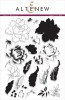
Hello crafty friends! I am back with another card featuring the beautiful Peony Bouquet stamp set by Altenew. I had already used it here in the past and kept it light and simple. Today, I wanted to go the other way and add loads of color and contrast.


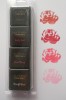
I had a leftover piece from another project – a scalloped circle from the My Favorite Things Scallop Circle set. I stamped the Peony on that circle using three different inks. I think the trick here is to use one color twice. I opted to use the Altenew red as my darkest color, so I used it for both the outline as well as the deepest shadows.


Since the contrast wasn't as high as I wanted it to be, I grabbed my Copic Multiliner and added a few black strokes into the deepest shadows. You don't have to do that, but I really wanted the contrast to pop.


Lastly, I added a few sequins for additional sparkle, but kept my little square card very clean and simple otherwise. Thank you for stopping by today! I hope you got inspired!

Saturday, 27 August 2016

Vibrant Spring Card with Fall Florals

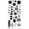
Aloha, crafty friends! I feel this card today is so tropical that I cannot use any other type of greeting. Despite, at the time I was making this card, being less than a month away from the first of my two moves (so this was early January), I decided to buy some of the My Favorite Things Dye inks which had just come to Seven Hills Crafts. And I was not disappointed – these dye inks area vibrant and give great coverage right away unlike the HA inks which get muted and need to smooth out, sometimes blurring finer details. Armed with these new inks I was finally motivated to use my My Favorite Things Fall Florals stamp set for a spring card (because at the time of making this card, spring was the season coming up :)


I started out by die cutting a panel from linen card stock and sponging on some Distress Ink in fresh colors, then spritzing it generously with my trusty water+Perfect Pearl solution to make the ink run and blend. I used my fingers to move it around even more – loved getting messy here :)


Stamping the floral images was fun, but fussy cutting them certainly wasn't. The downside of my Scan n Cut is that when you use light inks to stamp your images, it doesn't see them and therefore can't cut them. You can create cutting templates, but if you want a border around them, the minimum is 3mm and not 1mm as you'd get if you'd cut directly (and not from a saved shape). So, I might spring for the dies for this set after all.


Overall, I am happy with the card even if the fussy cutting did nothing for the state of my hands. But the new inks – so lush, so vibrant, and no longer anxious waiting to see how the stamped image would eventually turn out. Don't confuse the dye inks with the hybrid inks, though! The hybrid inks are much paler, and I wasn't happy with them (save for Licorice, my go-to black). So, if you want fresh, vibrant colors with great coverage, go for the dye inks!

Have a great day!

Saturday, 18 June 2016

Cheerful Get Well Card

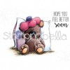
Howdy, crafters! Today I have two cards for you featuring the same super cute Stamping Bella stamp but different overall design. I am re-discovering my love for combining watercolor markers and my blender pens. Shall we have a look?


As much as I love my Blender Pens (I prefer the one from Stampin Up because of the durable nib, the one from the Dove pen just disintegrates all the time), they are a bit tricky to use. I have mentioned in my previous posts you can easily start damaging the paper and pill it up because rubbing it with the tip just does that. I have tried oodles of different watercolor papers (super cheap ones to super expensive ones) and still it happens and it's something you have to accept. I can only suggest to a) use a very light hand and b) let previous layers dry fully before going back in with the pen to reduce the strain on the paper.


 (I am showing you one card here, and on my blog - link in sidebar - you can see a video for the other version)

As you might have noticed, I've become obsessed with bright colors and sparkle. Can't tell you why, but I need to put sparkle on everything right now. The cheapest and easiest way is via a self-made spray. All you need is Perfect Pearls in the color Perfect Pearl and a mini mister. I used to add the Perfect Pearl via a brush in the past, but Jennifer McGuire's suggestion to instead put it into a mini mister with some water is simply brilliant. I usually spray my project from an arm length away, immediately heat set it if I don't want the colors to run, and the spray again and heat set (two layers of spray gives gorgeous sparkle!).


I hope you enjoyed the project and found the tips helpful. Thank you for stopping by today, I really appreciate it!

Saturday, 16 April 2016

The Chick Who Couldn't Even

Hi, my name is Julia and I just don't know how to use patterned paper. How's that for an introduction :-)

I love patterned paper. I love to buy it, I love to look at it, but when it comes to using it, I just don't know what to do. I'm not sure if it's my style of card making, but I always feel that the patterned paper is making my card worse, not better. To err on the side of caution, I decided to just cover my entire card front with the same pattern on this project today :-)


For my focal point, I used a super cute image by Stamping Bella and colored it with Inktense pencils. As you know, I usually work in layers with these pencils, working my way up from the brightest color to the darkest. For some additional interest, I added some pearlescent watercolors on top of the finished image to make it sparkle and shine. Alternatively, you could mist it with water into which you add some Perfect Pearls.


I used a scalloped circle die by My Favorite Things to grab just a portion of the image that I wanted and then mounted it with foam tape onto my card base which I had already covered with my patterned paper. I cut two slits to thread through some ribbon for a bow.


This chickie is just one of three that come with the stamp set and it also comes with some fantastic sentiments. I think these would be perfect if you need to apologize to somebody, for example missing a birthday :-)

I hope you enjoyed today's project and you have a fantastic weekend. Catch you again soon!

Saturday, 2 April 2016

A Colorful Floral Bouquet

Hi crafty friends! Today I have a card which was inspired by the wonderful, unique, funny, and insanely talented Laura Bassen.
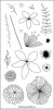

As you can see, it's the flowers that stole my heart: I stamped a whole bunch of them on sturdy card stock with Versamark ink, then heat embossed the images with white embossing powder. Thanks to my Distress Inks, I could easily add color on top since the embossing powder resists the ink. Then came the part where I had to fussy cut all of it out, which took a toll on my hands, but it just looks so PRETTY!


Before I proceeded, I die cut a window with the My Favorite Things Scallop Stitched Circles into a panel of white card stock and stamped the sentiment from Concord & 9th's Being Classy set through that opening on my card base, then adhered the front panel with foam tape for some dimension. Before adhering the flower, I sprayed them gently with Perfect Pearls to get some beautiful shimmer.


As a last touch, I added some sequins to my card in colors that mirrored the colors of the florals and of course I couldn't help myself but add a few dots with my Stardust gel pen.

Thank you for stopping by today! I hope you got inspired!