

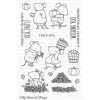
As you can see, the magic ingredient is the white border around the colored images. You can almost go as dark as you like in your coloring without worrying that the image will look pale against the non-white paper. The white outline – either achieved with dies or fussy cutting – will do all the work for you.

By the way, this would work just as well with other colors of cardbases, too, not just craft. Imagine how you can use this technique for your holiday cards! Thank you for stopping by today! I hope you got inspired!


Such adorable images, and your colouring is perfect! I love the effect of the "pop" of white border against the background. Have a fab weekend :)
ReplyDeleteThis comment has been removed by the author.
ReplyDeleteI love the simplicity of this look and hope to try it out soon. Thanks for sharing!
ReplyDeleteYes of course! Love kraft but often don't use it as images do get lost. It will be fussy cutting for me though as matching dies are usually sooooo expensive. Lovely card!
ReplyDeleteI love the contrast...this craft background is perfect against orange,green and red.
ReplyDelete