Happy Valentines Day folks - sorry - nothing lovey-dovey on the blog today - except my love of ink! Today I have 4 cards that show off the great new range of
premium dye inks from My Favorite Things that we have just started to stock. At the time of writing we are the only store in the UK to stock these inks we believe so we're glad to be bringing you another first! There are currently 82 shades available but they didn't have them all available so some may be showing as out of stock in the store already - we will get them as soon as we can on future orders. I've had a little play with mine this afternoon and I am REALLY pleased with them for both stamping and ink blending and the colour range is just amazing.
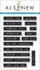
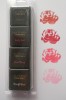
The colour names are on the back of the pads - so I do recommend labelling the lids so you don't mix them up when using them. There are a few shades that are not quite like the lids - as you can see from my labels below, but not many so ordering from the site should be easy.
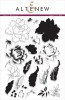
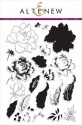
First off I wanted to see how they stamped. I am sorry but I used an out of stock stamp set from Altenew as I wanted to see how well they layered and Altenew florals are great for this. I hope you will forgive me, this post is more about the inks than the stamps!
I used cotton candy, ripe raspberry and pure plum on the flower and gumdrop green, dill pickle and elf green on the flower. You can see from the close up how good the coverage is. Unlike Hero Arts inks the colour is pretty solid from the get go but it does still even out a little as it dries. I finished with a sentiment from
Birthday Greetings also by MFT which is full of lots of useful Birthday sentiments.
I used the same stamp set again but this time gave it a vintage look by stamping everything using just 3 shades of brown - biscotti, milk chocolate and chocolate brown. Once I'd layered all the stamping and let it dry, I then did some very subtle ink blending using two shades - natural and latte to give a sepia, faded vintage look to the whole card.
The ink blending seemed to work ok so I got a bit braver and went for a rainbow back ground stripe. I used, from top to bottom, banana split, sunshine, orange fizz, razzleberry and pure plum, simple done between two strips of post-it tape for masking. I am NOT the greatest ink blender, but these worked really well for me, I actually seemed to get better results than I do from my distress inks. There was a little patchiness to begin with but it had dried smooth by the time I started on the next colour. I added some stamped silhouette stems form
Fall Florals and another sentiment from the
Birthday Greetings set.
So for my final card I got really brave and decided to ink blend the whole front of the card, and when bravery is called for with colour I fall back to my faves (our logo colours!) so this one goes from tropical teal in the bottom left corner through blu raspberry, spearmint and into sour apple in the top right. I am really pleased with how it came out and I just adore these colours!
The stamping this time comes from
Happy Wishes by Wplus9 - I love the scripty font and the leaves and florals have a natural curve to them that makes them naturally look 3D. I decided to keep it bold and black and let the colour beneath speak for itself.
NEWS FROM THE STORE:
It's going to be a busy week coming up:
- Mama Elephant has a new release on 15th - it only shipped to us on Friday so we might not have it for release day but it won't be far behind.
- Lawn Fawn release is on the 18th - our parcels are currently stuck in customs but we are fairly sure we'll have them for release day.
- We have packages from SugarPea Designs and Avery Elle also in transit for releases later in the month.
- There are a few smaller releases we've missed out on but we'll catch up with those in March when the major CHA releases have calmed down.
Thanks
Tara