Showing posts with label Altenew Beautiful Day. Show all posts
Showing posts with label Altenew Beautiful Day. Show all posts
Thursday, 20 April 2017
Watercolour birthday card with Altenew Beautiful Day
Hi everyone, it's Esther and I'm back for an extra day this week. Today I've got a watercolour birthday card to show you using Altenew Beautiful Day. This is such a gorgeous set, I just can't stop reaching for it! Last week I went vintage with it, and today I've gone for pretty lilac, blue and yellow-green.
I stamped and masked the outline peony repeatedly round the edge of a panel of watercolour card stock, adding two outline leaf sprays. Then I reached for my Zig Clean Color Real Brush Pens and scribbled them on an acrylic block to pick up with a water brush for the wet-on-wet technique. I used 045 Pale Green and 053 Yellow Green for outside the flowers. The lilac peonies use 036 Pale Blue, 080 Violet and 081 Light Violet. The blue peonies use 031 Cobalt Blue, 036 Pale Blue and 081 Light Violet. After the panel was dry, I used a fan brush to splatter 031 Cobalt Blue, 080 Violet and 010 Black over the flowers.
Next, I stamped and heat embossed the sentiment from the same set in white on black card, and die cut it with a sentiment strip from Avery Elle Pierced Banner Layer Elements. As this is currently out of stock, you could use My Favorite Things Stitched Sentiment Strips Dienamics instead.
Finally I layered up the watercolour panel on a wider panel of black card stock, added the sentiment and popped the whole lot on a card base.
That's it from me for this week - see you next Wednesday and thanks for stopping by!
Wednesday, 12 April 2017
Vintage card with Altenew Beautiful Day
Hi everyone, it's Esther here with a vintage card using the lovely peony stamp from Altenew Beautiful Day.
I've seen this stamp set used in so many beautiful ways - bright colours, pastels, watercoloured, stamped, coloured pencils - that I knew it was really versatile. But I wanted to do something a bit different and create a vintage card with the feel of an aged bookplate or illustration.
I stamped a background layer using the leaf spray in a pale outline ink and two shades of infill ink. It was die cut into a stitched rectangle using My Favorite Things Blueprints 29, and a negative sentiment strip was cut away using My Favorite Things Stitched Rectangle Word Windows Dienamics.
I then stamped the peony and two of the leaf sprays onto watercolour card stock and used vintage colours of pink, brown and green ink to stamp them. The main colour of the peony is a faded pink which I smoothed out with a watercolour brush, but the other layers were stamped "as is" and left a bit mottled on purpose for a more aged effect.
A computer generated sentiment reads "Fig 1. Paeonia" as a vintage-style label for the peony's Latin name, and was aged with ink and light ink splatters. This was glued to the card base, with the panel, peony and leaves layered on top.
Thanks so much for visiting!
Saturday, 10 September 2016
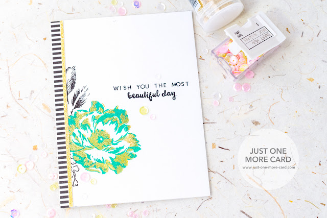
Embossed Florals
Hi crafty friends, today I am trying something new to me and I’m trying to go for a very modern looks with fresh colors and bold stripes. This card was inspired by the wonderful Stephanie Klauck.
I have to admit, originally I had wanted to use the solid floral background stamp and then emboss the fine outline image on top of it, but I just couldn’t figure out how to line up the stamps … so I decided to go with two other layers from the same stamp set ;)
I think for me, the color combination and the stripes are what makes this card “modern”: the gold over the fresh mint color is just something that I can’t associate with traditional color schemes. And the thin patterned paper strip really adds contrast to the otherwise very simple and clean design.
The gold strip of paper was an afterthought: I didn’t like the way the patterned paper bumped against the design, so the gold strip is softening this transition. Of course, I had to add a few sequins for sparkle.
Thank you for stopping by today! I hope you got inspired!
Tuesday, 10 May 2016
Keeping it CAS with Altenew
Hey crafters! Julia here today – I know you're expecting Keren, but we did a switch. So, no worries! She'll delight you with her creations later this week.
You know how I always struggle with my fear of white space and how I just have to mess with it? Yeah. With this card, though, I stayed the course even though everything in me screamed to add embellishments, more images, … something to make it less white. I have to admit – I love how it turned out, so maybe that will help me in the future to bravely allow for more white space.
I started out by stamping the same flower from Altenew’s “Botanical Garden” twice in the lower corner and once in the top corner. I didn’t do any fancy masking, just made sure the images on the bottom wouldn’t overlap.
Since I knew that I wanted to keep the card CAS (just had no clue if I would succeed this time or not) I decided on some strong colors and picked some oranges and yellow out of my Copic collection. Since I needed to blend from dark to very light, I only added a tiny amount of each of the used colors to allow for room to actually blend. If you use too much of one color, you don’t really have enough room to go from dark to light, especially in a small image as this one.
You can see that I didn’t do anything fancy. I didn’t try to hint at petals or texture, I simply blended from light to dark, which is your most basic Copic technique – everyone can do it! And since it’s a piece of art, you have creative license to do with it whatever you wish – no reason to feel bad because you didn’t try to turn it into a museum-worthy masterpiece. Just have fun :)
Another tip: if you don’t have Copic paper which is bleed proof (meaning you don’t see the color on the flip side), no worries. Just cut a panel the same size as your card front, color on it, and then glue it to the front of your card. No one will know the difference, and technically it’s still a one layer card :)
Thank you for stopping by today! I hope you got inspired!
Subscribe to:
Posts (Atom)


