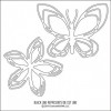
Colorful greetings, crafters! Today I am using some fantastic stamps and dies by Concord & 9th. Actually, I am mostly focussing on the negative die cuts from the butterfly die that is so wonderfully intricate it's a pure joy to use:
Since I wanted the colors on this butterfly to shine, I selected to go with some black card stock as a base here. I started out by adding some Stick It to a piece of paper and die cutting it with the butterfly die. The adhesive side would be on the bottom to attach the pieces to the card. I used the outline of the butterfly on another project and the negative pieces here: I used my Copic markers to create a gradient following the color wheel and kept my colors light so they would shine against the black.
To add my pieces to the card, I die cut the butterfly again from some sturdy card stock and used the outline as a placement help – I just laid it where I wanted the pieces to go and then puzzled them in. Since my butterfly didn't have a body, I grabbed a few pearls in different sizes and glued them where the body would go. Of course I needed a nice and bold sentiment, and I heat embossing the words from the Classy stamp set in white embossing powder.
The black mat was cut using my all-time favorite Sunshine Layers dies by Wplus9, and the card base itself was covered with a piece of grey paper which I had run through my Stitched Mats dies to create the stitched border.
Thank you for stopping by today! I hope you got inspired!
Showing posts with label Concord & 9th Being Classy. Show all posts
Showing posts with label Concord & 9th Being Classy. Show all posts
Tuesday, 4 October 2016
Saturday, 1 October 2016
Intricate Die Cuts and A Soothing Color Scheme
Hello crafty friends! It's the weekend again, and I hope will have time to craft a bit and just let your soul relax. To inspire you, I'm sharing a project featuring Concord & 9th supplies today. Mainly, I have fallen for the gorgeous, intricate flower die cuts:
I die cut those flowers from very sturdy card stock (scraps I found lying around) and then colored them with one color of Copic each. I made sure to have a light one, one mid-tone, and one dark blue-green color. Then it was just about arranging those flower on my center piece and not cover up too much of the sentiment:
The sentiment is from the Being Classy stamp set – I love the big handwritten font, it can be the centerpiece of a card just by itself. As for the color scheme, I actually looked that one up on Pinterest and I love the soft browns with the fresh mint colors.
For embellishment, I added a few pearls and dots with a silver gel pen. You know I can't help myself ;)
Thank you for stopping by today! I hope you got inspired!
Saturday, 30 April 2016
High Contrast Card with Concord & 9th
Hi crafty friends! What to do with leftovers? Of course I didn't want to throw them out after all the work I had put into creating them – mainly cutting them out!
Since my first project with them was a very airy, bright card I decided to go the opposite direction now and use a black card base and work with contrast. I arranged the flowers and then used glue and some foam tape to adhere them along the edge. They were originally overhanging to the side, but I cut off whatever was off of the card base and used some of those snippets and added them to the card in another place. Talk about re-purposing :)
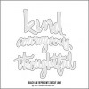
I heat embossed the sentiment from Being Classy with gold embossing powder and then used the Being Classy dies to cut the word and adhered it to the card base. I added some confetti, but also lots of white dots and some crosses with my Stardust gel pen, which makes it look like sparkle.
I really like how this card turned out, especially compared to the first project I did with those flowers. It just shows how the same stamps can be used in very different ways to create cards that look wildly different.
Thank you for stopping by today! I hope you got inspired!
Saturday, 2 April 2016
A Colorful Floral Bouquet
Hi crafty friends! Today I have a card which was inspired by the wonderful, unique, funny, and insanely talented Laura Bassen.
As you can see, it's the flowers that stole my heart: I stamped a whole bunch of them on sturdy card stock with Versamark ink, then heat embossed the images with white embossing powder. Thanks to my Distress Inks, I could easily add color on top since the embossing powder resists the ink. Then came the part where I had to fussy cut all of it out, which took a toll on my hands, but it just looks so PRETTY!
Before I proceeded, I die cut a window with the My Favorite Things Scallop Stitched Circles into a panel of white card stock and stamped the sentiment from Concord & 9th's Being Classy set through that opening on my card base, then adhered the front panel with foam tape for some dimension. Before adhering the flower, I sprayed them gently with Perfect Pearls to get some beautiful shimmer.
As a last touch, I added some sequins to my card in colors that mirrored the colors of the florals and of course I couldn't help myself but add a few dots with my Stardust gel pen.
Thank you for stopping by today! I hope you got inspired!
Subscribe to:
Posts (Atom)


