

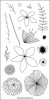
Since my first project with them was a very airy, bright card I decided to go the opposite direction now and use a black card base and work with contrast. I arranged the flowers and then used glue and some foam tape to adhere them along the edge. They were originally overhanging to the side, but I cut off whatever was off of the card base and used some of those snippets and added them to the card in another place. Talk about re-purposing :)

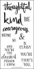
I heat embossed the sentiment from Being Classy with gold embossing powder and then used the Being Classy dies to cut the word and adhered it to the card base. I added some confetti, but also lots of white dots and some crosses with my Stardust gel pen, which makes it look like sparkle.

I really like how this card turned out, especially compared to the first project I did with those flowers. It just shows how the same stamps can be used in very different ways to create cards that look wildly different.
Thank you for stopping by today! I hope you got inspired!
No comments:
Post a Comment
Thanks for taking the time to leave a comment - we hope the blog inspires your creativity.
The Seven Hills Crafts Design Team