
Seven Hills Crafts is now stocking the MFT Licorice Hybrid ink, after I kept poking Tara to add it to the store. I’ve been using this ink for half a year now, and it’s become my only ink for techniques! I used to use Memento for Copics and Archival ink for watercolors and pencils; and I was constantly annoyed that I had to decide up-front which technique I’d use on a card. After I had stamped an image with Archival ink, I couldn’t just grab my Copics because that ink would not work with alcohol markers. Low and behold, I got my mittens on the MFT Hybrid ink – and it answered all my crafty prayers!

You might ask: what’s the difference between the Hybrid and the Dye ink from MFT? From my personal experience:
- The dye ink is much more intense than the Hybrid ink. If you are looking for luscious colors to stamp florals and shapes, the dye ink is definitely better suited for that. The hybrid ink is rather pale, which I personally don’t like.
- The hybrid ink is much better suited for techniques because it doesn’t react with your coloring mediums.
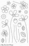
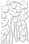
To prove my point, here’s a comparison of the black inks. I stamped each image separately and colored it about 20 seconds after stamping (the time it takes me to clean my stamp, dry it, and put it back). I used the floral image and the leaf because while the floral image might allow you to color without having to go over stamped lines (when you're super careful), the leaf makes that almost impossible (or at least a lot more complicated).
When used with Copics:

The effect varies with the paper you are using, but in this example, you can see how the dye ink on the left starts to feather – the stamped lines are no longer crisp but they start to fuzzy out. It's very hard to show in the picture, but there's also some color contamination. The colors are not as bright and intense because some of the black ink got mixed into the coloration. I intentionally went onto the stamped lines on both images (dye and hybrid) to force the issue.
Next up, watercolor (yes, I'm German and spent one year in the US, so I'm not spelling it "colour" ;) ):

I think this speaks for itself. As soon as you wet the dye ink, it completely ruins the image. It reacts strongly with water and bleeds into your colors. The hybrid ink, once more, stoically takes the water and doesn’t react. You can clearly see how light the colors are on the right (hybrid) and how much darker on the left (dye). I went outside the lines a bit and you can see that this isn't simple orange there; there's definitely some black mixed into it. Also, the leaf is much darker with the dye than with the hybrid.
Lastly, pencil blending solution. I personally use Zest It!, which is comparable to the US Gamsol (which I can’t get in Germany). I don’t have any baby oil right now, so I can’t say how it will react with that.

My usual blending doesn’t involve a lot of solution, normally, but I do use it occasionally to get a nice blend on larger areas or where I have trouble smoothing it out. I was surprised, though, that even without the solution, the pencils smeared the ink. In the left images (dye) you can clearly see black inside of the flower and the leaf is much darker. On the right (hybrid) you have the true color, which is of course much lighter because it's not contaminated.
Taking all of that into account, I can wholeheartedly recommend the MFT Hybrid ink for those of you using coloring techniques. It will just make your life a LOT easier to have just one ink pad for everything. If you already own the dye version of the ink, no reason to throw that out. The dye version is a bit richer and darker, so it can still be a great ink when used with sentiments, even though my personal favorite it Versafine. But if you need a fast drying dye ink instead of a pigment ink, the MFT Licorice dye ink is definitely an alternative.
Now, how does that all work in “real” life? Well, the projects you’ve seen me share over the past few months have all been using the MFT Licorice Hybrid ink. I’ve been putting it through its paces, so I’m confident in recommending it to you. Of course I also used it on today’s project where I paired it with Copics:

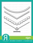
One neat trick to make the florals appear to me much “more” (in terms of numbers, volume) is to have them peek out from underneath a die-cut border – and the Reverse Confetti edge dies are just a great transition. By having the florals peek out from under that border, it looks like there’s a million of them hidden underneath the panel, when indeed there are … none :)

I decided to add some highlights with my white gel pen. Of course, it enhances the “whimsy” look; if you are going more for an elegant style, skip the dots.

If you would like to see a video of how I created this card, hop on over to my blog (link in the sidebar). You'll see that I'm not gently coloring in these florals but really work that color to make ti blend. Thank you for stopping by today – I hope you got inspired and that my ink comparison might make your crafty life easier. Cheers!


That's one of a serious comparison...wow...thank you for this in depth look on how these inks really reacts to coloring mediums...fantastic job...that will be a huge help for my next ink shopping...thank you for your effort!
ReplyDeleteAw this is brilliant, thanks. I've discovered the MFT Hybrid Ink myself and I'm DELIGHTED that you convinced Tara to stock it, thanks. It's also really useful to see the reaction with the dye inks as I've often wondered if they'd work. Many many thanks x
ReplyDeleteAw this is brilliant, thanks. I've discovered the MFT Hybrid Ink myself and I'm DELIGHTED that you convinced Tara to stock it, thanks. It's also really useful to see the reaction with the dye inks as I've often wondered if they'd work. Many many thanks x
ReplyDeleteGorgeous card!! and coloring and great product review!!!
ReplyDeleteFab post, Julia- love the review and a gorgeous card! x
ReplyDeleteThat was really helpful, thank you for all the hard work x
ReplyDelete